Report: Beyond bookings
Competition among digital products has steadily increased and providing sleek digital booking experiences with the power to convert and engage users is challenging for brands.
At Future Platforms, we were curious to find out the secret ingredients behind the brands that get it right.
Bookings are a core element for brands, driving revenue and customer acquisition. Brands that offer better experiences outperform competitors by 80% revenue wise as customers are 7x more likely to return.
We analysed 10 brands across different industries to see who performed the best and why, and what others can do to improve.
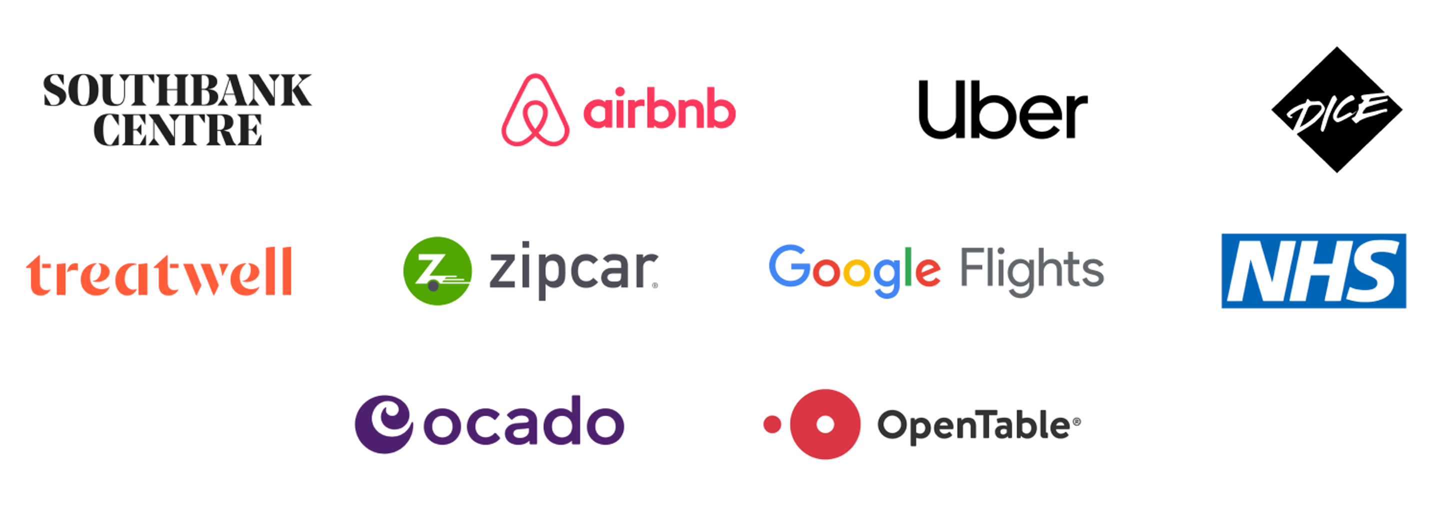
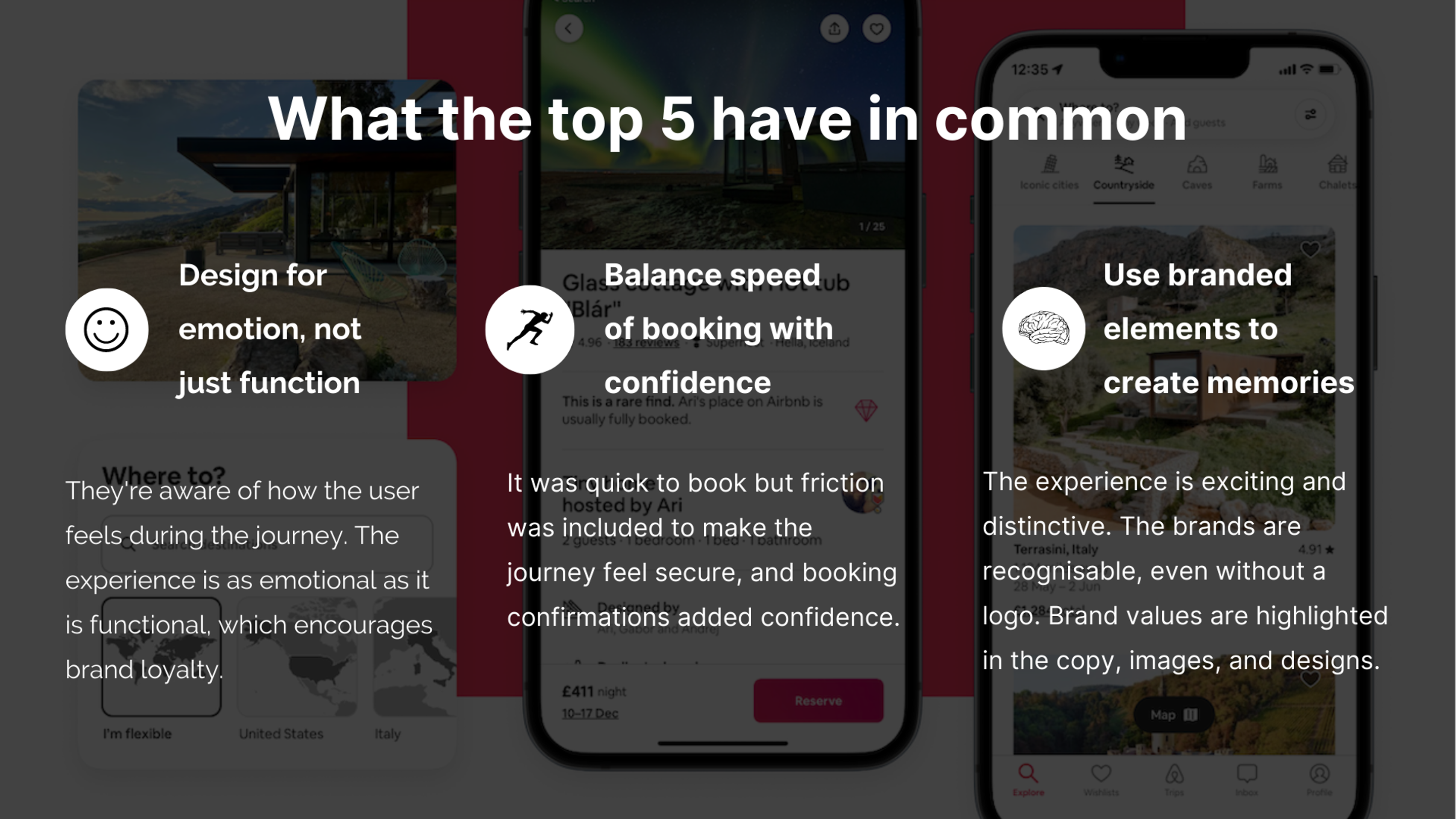
Who we reviewed
To do this fairly, we chose brands we know and love, and use often - across a range of industries.
What we measured
We devised our own rating system to evaluate each brand across criteria relating specifically to the booking experience. Our team booked several services (with many self-care days to look forward to, thanks to Treatwell!) to get the full experience.
We set criteria within a rating matrix to decide whether a brand was:
Brands were marked against the following categories:
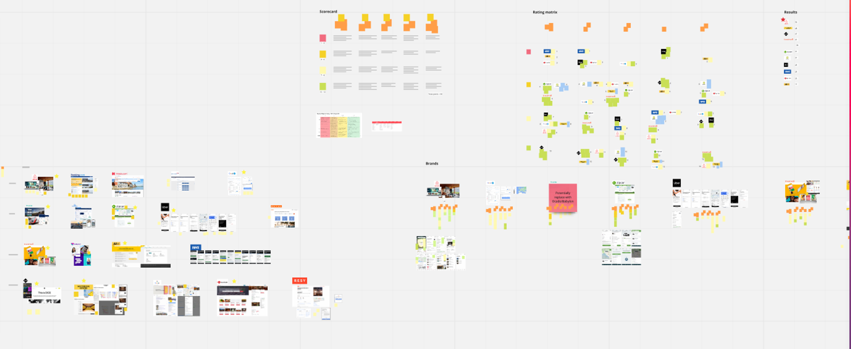
Each category presented an opportunity for brands to win 12 points, with 12 being the highest (leading) and 1 the lowest (latent), naturally. This brought the overall total score to 60.
Who came out on top?
In first place…Airbnb: 50/60
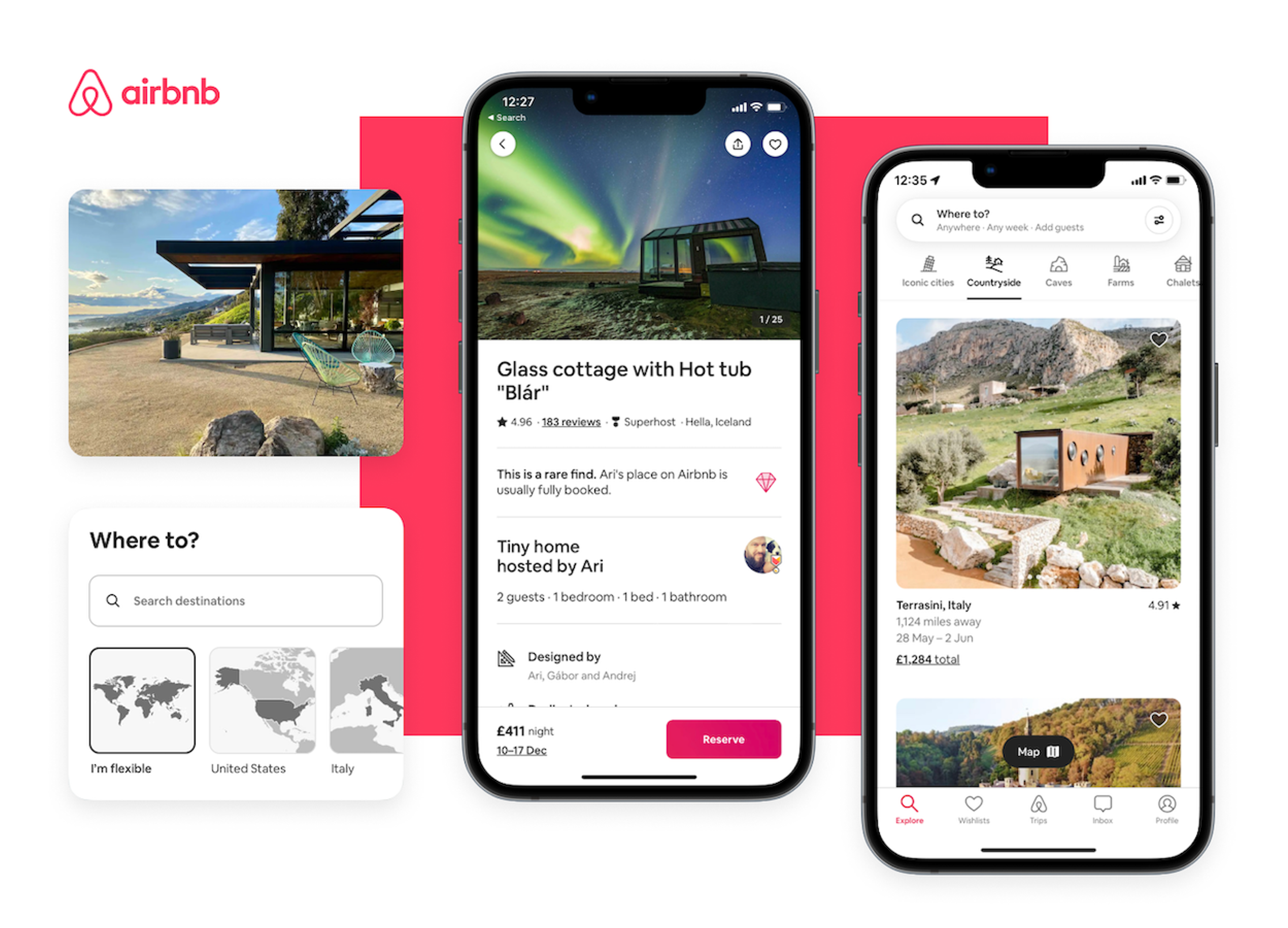
What Airbnb does really well is change with the evolving landscape, using data to uncover changing user behaviour and then modifying its platform to capitalise on these. The recent redesign is a great example of this.
It came out on top due to its ability to inspire, clear messaging and brand, and using distinctive and beautiful images that leave you excited for your trip.
Close runner-up…Southbank Centre: 48/60
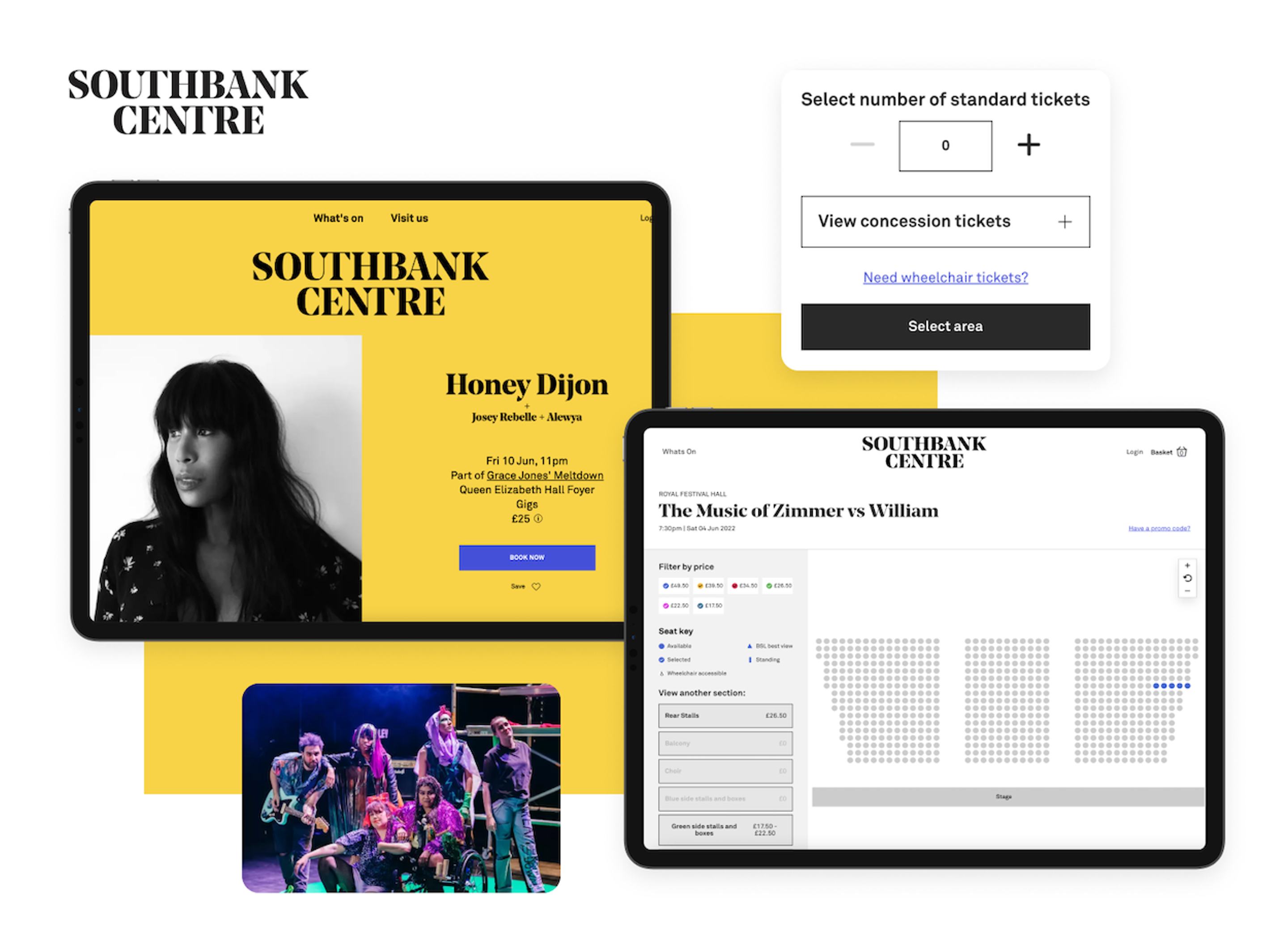
It’s important to recognise that Southbank Centre is a comparatively small and independent business, so for it to have come second makes it all the more impressive.
We were especially taken with how easy it was to book and see upcoming events. Its website cleverly weaves in elements of the architecture from the physical centre to differentiate the booking experience. When you select a seat, it shows an image of your view of the stage from that seat, which helps you feel more confident. Kudos!
And in third…DICE: 47/60
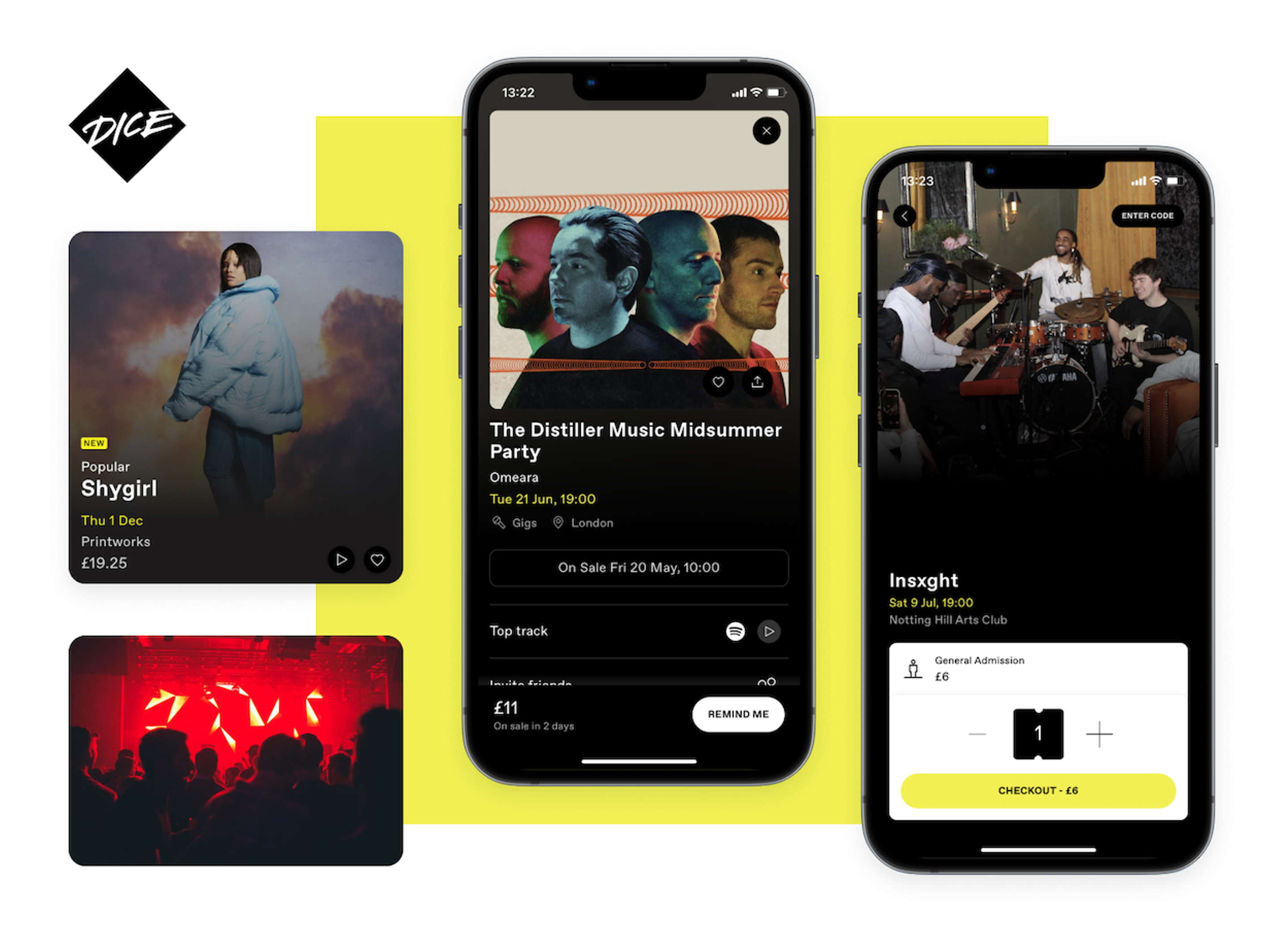
DICE had the potential to take the top spot but unfortunately lost points due to some difficulties when it came to transferring tickets to a friend, and QR codes in the app relying on signal and data in order to scan at venues.
However, we liked its quick booking journey, great imagery, and inspiration for events. We especially loved that it can link to Spotify to make the experience incredibly personalised, showing us relevant events and promoting artists we like!
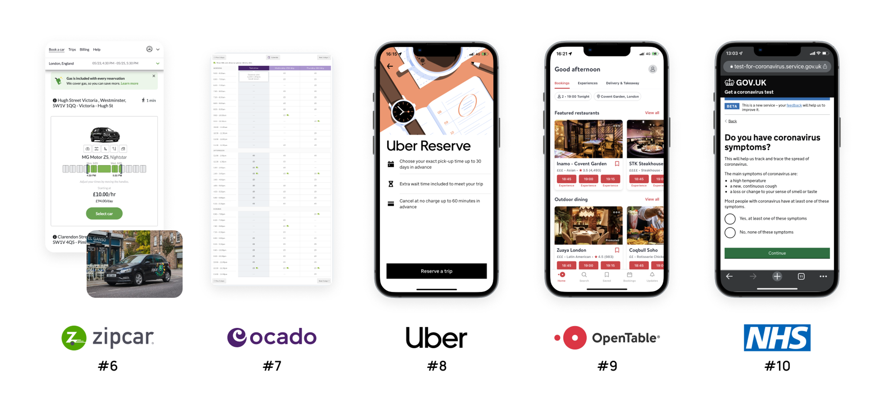
How the other brands fared…
How the bottom 5 can improve – key takeaways
Make it easier to convert
A good booking experience should have a clear next step where and intuitive journey. Friction should be used at the right moment to create a pause that makes the experience feel secure, and accessibility should be carefully considered, not just an afterthought.
Show off their personality
Some of the bottom 5 brands lacked a distinctive personality in the booking experience. For example, Ocado felt like any other online supermarket. Considering it’s one of the more expensive supermarkets, our team expected a sleeker design and distinctive elements that distinguish the Ocado brand.
Create a memorable journey
Whether an experience is memorable or not is dependent on unique elements that stay in a user’s mind after a booking has been made. We also marked brands on whether they considered human emotions at the time of booking and found definite room for improvement in this area with the bottom 5 brands!
Want to know how your brand’s booking experience measures up? Let’s talk.


