The NHS Track-and-Trace App: The Good, the Bad, and the Ugly
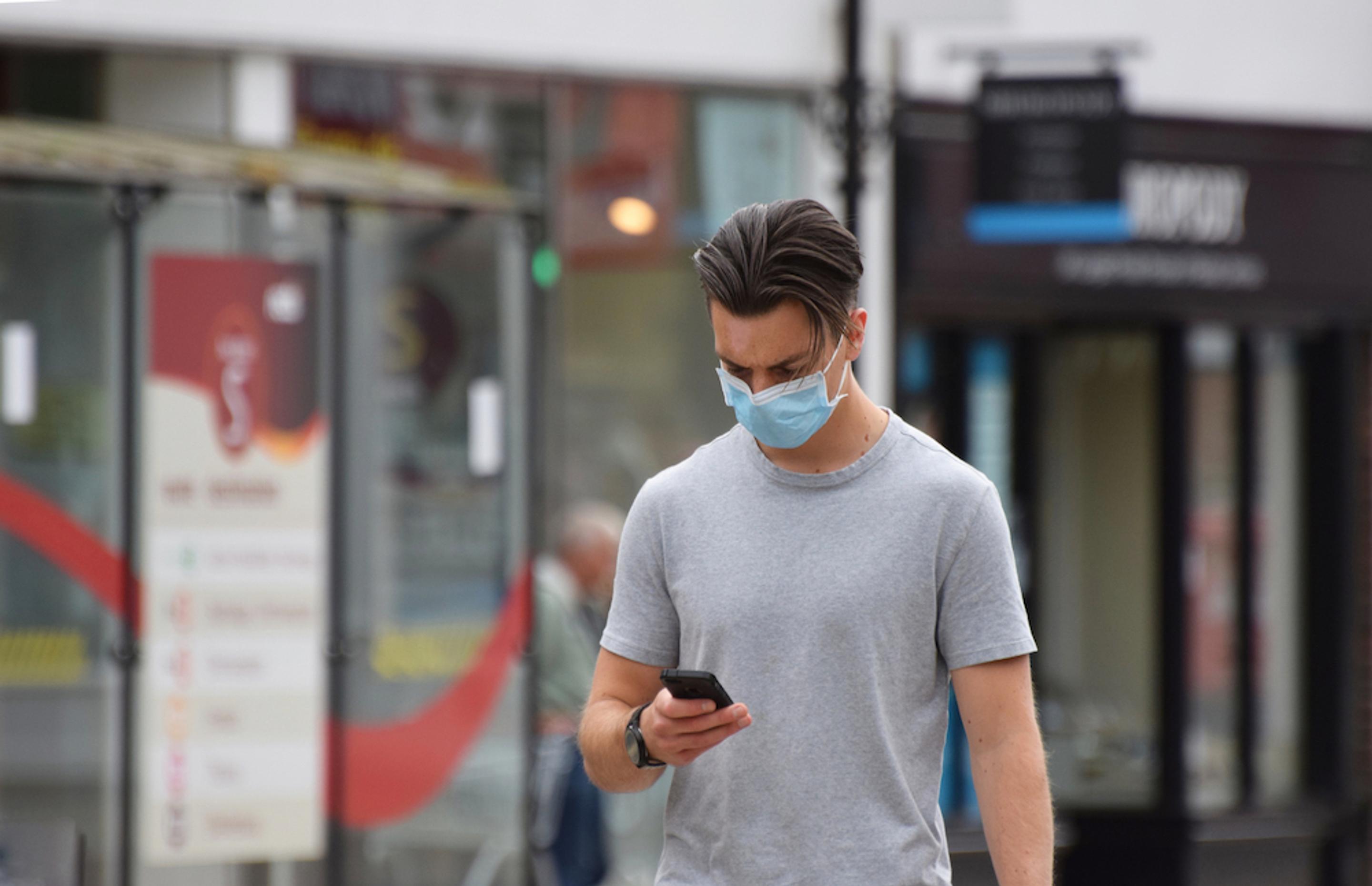
As part of our App Teardown series, we decided to dissect the NHS track-and-trace app to find out if it was worth all the wait.
The NHS track-and-trace has finally been released, after several months of delays. Its initial trial run in March was...not a success. It was abandoned due to technical failings, which was largely around the centralisation of data. The centralisation of data posed two very serious issues: it’s worse for user privacy and much less reliable, as phones cannot keep tracking in the background.
The new track-and-trace app relies on Apple and Google technology, using the tech giants’ APIs to deliver a more secure app that works. At £35 million and several delays, it’s a pricey app that has cost the public more than just money.
What is the NHS track-and-trace app?
Test, track and trace – it has been England’s mantra for fighting the virus since the first wave of coronavirus. But cases have been surging and after the first attempt at an NHS tracing app was scrapped, the country was put into disarray.
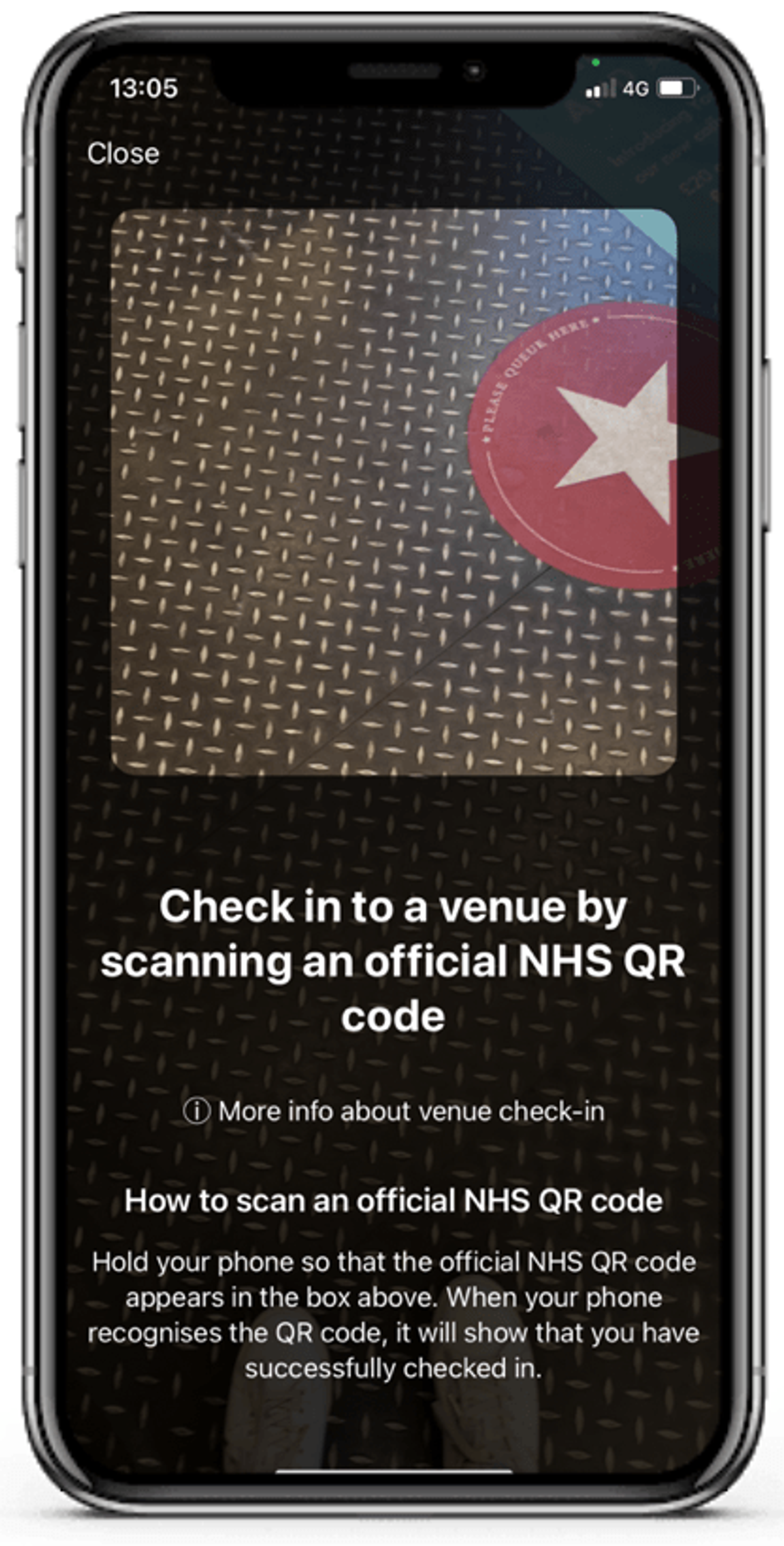
Now, the new Bluetooth-based mobile solution aims to give us hope for not only staying safer but also for the possibility of returning to normality sooner. The app can alert people when they have been near someone who has tested positive for COVID-19. It can also allow people to check their symptoms, book a test and ‘check in’ to places they visit using a QR code system.
How does it work?
Contact tracing has been used in the past, particularly for sexually transmitted diseases, such as HIV. Much like these, the NHS app works in a similar way by getting people to recount their steps to see who else may have been exposed but it automates the human process by using your smartphone. It uses Bluetooth to identify phones nearby, which are referred to as encounters. When someone tests positive, the system can send out alerts to people they have had encounters with.
The app can alert people about their exposure to people infected with COVID-19 faster than human contact tracers. This is crucial for a highly-infectious virus like COVID-19; particularly as people who may be asymptomatic can be alerted to having been in contact with someone who has tested positive, which means they will self-isolate. Without notification, an asymptomatic person would likely continue their day-to-day life, passing the virus on without knowing. The app notifies any person who has been in contact with someone infected, who is then encouraged to take a test. People are told to isolate whether they are ill or not.
In theory, this app is a great idea that will help save lives, curb the spread of the virus, and help us get back to a “normal” way of living. But contact tracing apps are new and their effectiveness has been largely unproven. We analysed the app inside and out to find out whether it really works.
Core user needs
Our UX Designer, Issy Everett, took the app for a test run and commented on some of its core features and functionality.
There are three crucial elements to the app that are integral to it fulfilling its function:
There are two main user types: healthy, and infected (has COVID-19). The app interface, therefore, should provide the user with useful information and clear instructions and actions to take based on their user type.
The Good
Let’s get stuck into the usability of the app first.
Downloading the app is very easy. Anyone with a smartphone and recent operating software (we’ll get to that later) can get the app from the App Store or Google Play.
The App Store listing is useful at displaying the functionality of the app, although there are some missed opportunities. The first screenshot – often used to grab users’ attention by showing a more creative display of the app – shows three small iPhone mockups of the same screen (an obvious mistake in itself). The listing sets the tone, and for us it seemed somewhat inappropriate for a health service dealing with a global pandemic.
Other good bits: the app also has a function that enables users to book a test, a local risk-level alert tool, a symptoms-reporter tool and a countdown timer to keep track of how long to stay in self-isolation.
Overall, the app allows you to perform key tasks, such as submitting symptoms, checking into venues, and knowing the risk level of your local area. Although it’s not the most eye-catching interface, it does the job of allowing users to access and input key information.
The Bad
The home screen of the app gives the user no clear direction or useful information. Unnecessary features are given as equal priority as primary functions. The user should have a clear purpose when entering the app – either they need to check in at a venue, or to submit a symptom or test. For an infected user, some of these primary functions, such as venue check in, are less important. The app shows this change in mode well, by showing a large isolation countdown.
For healthy users, a significant amount of the screen is given to a status update (“Your app is active and scanning”) – although this is a useful piece of information, it is one that is unlikely to change, and therefore a much lower priority. “Read latest advice” and “About this app” also distract from the main features.
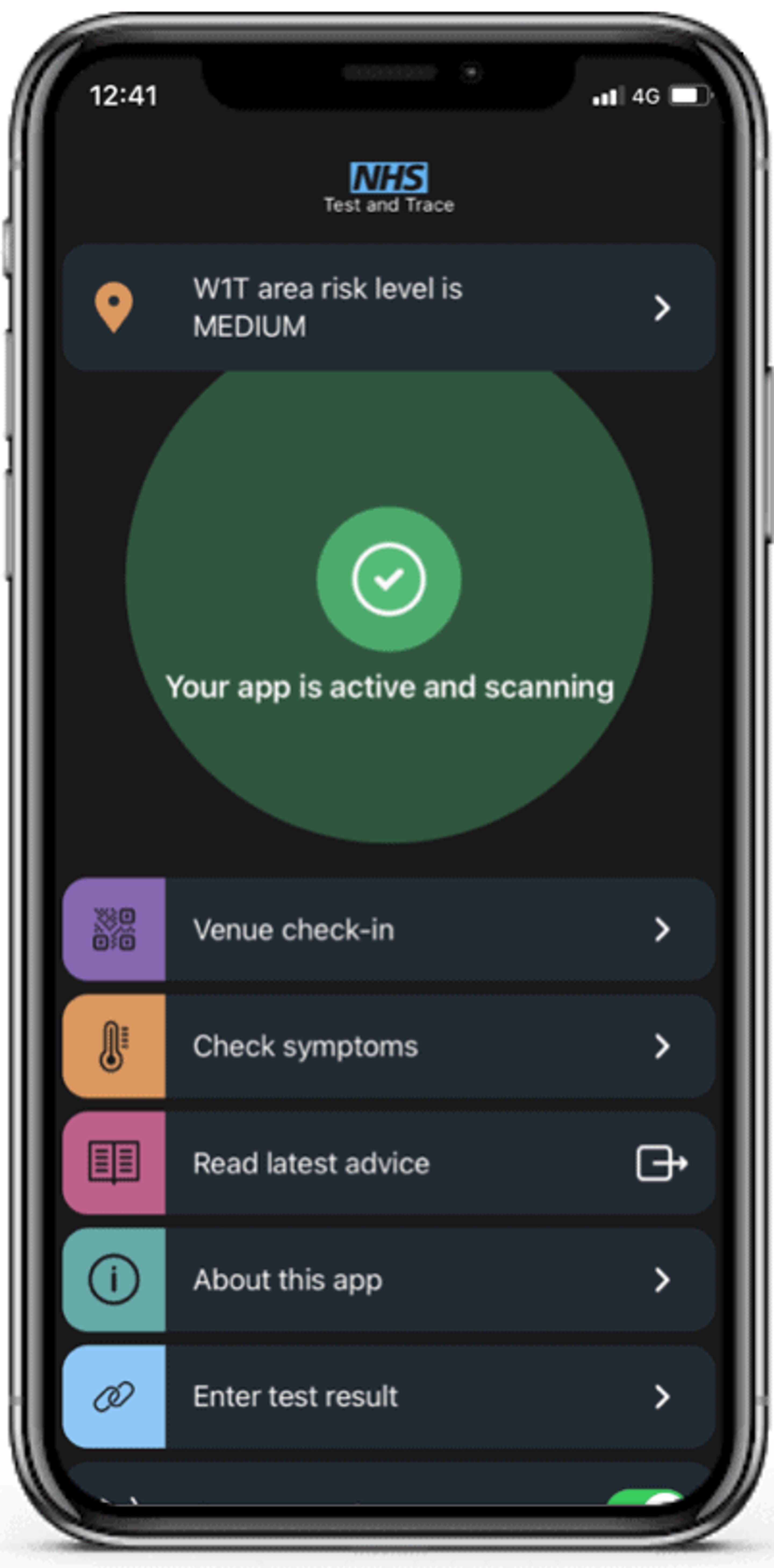
The local risk-level alert tool – which shows whether your area is at low, medium or high risk of infection – does not change with your location. This means that it will only show the risk level for the postcode you first enter when you download the app. If you frequently change location then tough luck – the app won’t automatically sense your location change and update your risk level accordingly.
Users are also given the option to turn off contact tracing. Contact tracing is the process of identifying all people that a COVID-19 patient has come in contact with. The entire aim of the app is to monitor and record this, so it shouldn’t be an option for a user to simply toggle this off.
Perhaps one of the biggest blunders, however, are the issues around phone compatibility. For the app to work, users need modern smartphone technology. Because the app heavily-utilises QR technology, it will not work on iPhones built in or before 2015 or Android devices with software released in the same year.
According to Apple, 92 percent of all iPhone devices it has introduced in the last four years globally are running at least iOS 13 – meaning they would be able to download the app. Matt Hancock has said the “vast majority” of the public has the right software. This doesn’t change the fact, however, that the technology is not inclusive of those most likely to own older smartphones, such as the elderly, who are the ones who are most at risk.
The Ugly
Health experts have criticised the app among cases soaring by 23,000 in one day. The cause? A technical issue with the app resulted in thousands of cases being left out of reported daily figures.
The technical issue was caused by the names of people reporting positive test results exceeding the maximum size of rows allowed in the Microsoft Excel sheet used to add new names to the automated system – yikes!
This has had a domino effect with more issues arising from the faulty data, such as the “daily totals reported on the UK government’s coronavirus dashboard over the last week [being] lower than the true number”, according to The National.
Not only has this “glitch” put lives at risk but it has caused the public to further doubt that their health is in safe hands and that future outbreaks can be predicted.
How we would improve this app
Issy Everett weighed in on what we would do to improve this app:
But most importantly? We would not have created a solution that relies on Microsoft Excel as a pivotal database management tool.
In our quest to improve the world through technology, we’re going to be reviewing more apps in our App Teardown series, so keep an eye out. Or, if you would like us to review your app, then get in touch and let’s chat.